WEB DESIGN
Congo Blue is a media production company based in Toronto, specifically working on set design and concert lighting for touring artists and bands. I was brought on by a remote operating agency's team to work on their rebrand and website update.
The project was completed amongst a small team of designers operating from separate remote locations across Toronto (Visual Designer ibra Balogun), Copenhagen (Designer/Cinematographer Tolu Alebiosu), and Osaka (Myself). Over the course of 3-4 months, we would routinely meet with our client virtually to review each stage of the branding/web design process. The revised logo/wordmark, which can be seen throughout the assets displayed on my portfolio site’s subpage, was based on concert topology and stadium seating arrangements.
I was directly responsible for the newsletter/promotion design, staging specs visuals and templating, as well as collaborating with the rest of the design team to contribute to the early branding concepts and assisting in arranging the new brand guideline.
Our final deliverables included a comprehensive graphic standards manual, relaunched website, newsletter templates, customized plotting graphs for technical lighting specs, and additional merchandizing to support the rebrand activation.
MORPHINE is a workwear apparel startup based in Seoul, South Korea.
After connecting with the team in Seoul and discussing their priorities as a brand and a business, I took on MORPHINE as a personal client to diversify my professional experience with apparel and E-Commerce design.
Tasked with a website update, packaging, and promotional materials for their drop-based release schedule, we started by thoroughly breaking down the vision the client had for their brand. The brand already had a wordmark, with a rudimentary website set up to start with. Very counterculture, with sustainability and production ethics in mind (MORPHINE produces all their products domestically, relying on minimal outside interference in their labour practices and values).
I crafted a very texture-oriented visual identity that pulled from the material selections featured in older Korean newspapers, punk editorial magazines, and use of recycled materials. The packaging, in particular, was designed to utilize recycled paper and minimal ink to create a hand-crafted aesthetic for branded delivery packaging (Being a primarily E-Commerce based business).
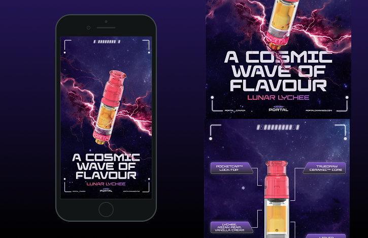
Since it's legalization across Canada in 2018, the cannabis/cbd industry has boomed across the country presenting an opportunity to capitalize on the serge of market potential. The primary goal of my time working with these brands was normalization. Approaching a historically stigmatized product with the same sincerity that I would any other product or service available on the market was integral to the success of our product launches, events, sales campaigns, and web experiences.
Working in-house and through freelance collaboration, this collection includes deliverables designed for Cannabis brands across Canada. Brands include CPG manufacturers and retailers respectively: FIKA, Thinker, AHLOT, Ganjika House, and Spinach.
Connecting with brands primarily based in the Greater Toronto Area, I collaborated with marketing and merchandizing departments respectively to execute brand deliverables and marketing campaigns. These include: product launches, promotional campaigns, merch/apparel drops, CBG packaging/print production, interior/exterior signage, POS screen design, and web design updates.
IN TRANSLATION: Art to Art was an art and audio exhibition debuting in downtown Toronto in 2022.
For the Third Solo Exhibition of Nigerian born Toronto Based artist Ugonna Ikechi, a bold signage system was created with the interior layout/colour palette of the exhibition space in mind. The campaign included a visual album titled "For the Love of Art", as well as a poster and animation featuring animated text and abstracted, manipulated videos. The design celebrated the eternal dialogue between art forms through curated visual translations of other pieces of art. The event featured performances from local musicians, DJ's, and writers within the greater Toronto creative network.
With a shared effort with the onboarded design team to communicate with Ikechi and the venue hosts, we delivered the following assets for the exhibit: print signage systems, motion graphics for the exhibit main room, E-banner's for ticketing, and a social media campaign targeting the independent art scene within Toronto's youth.
KSW Law is a Surrey-based law firm focused on grassroots values and community development.
As part of a team operating out of Vancouver and Western Europe, I was responsible for delivering the graphic standards manual for KSW's rebranding, illustration/iconography systems detailing their various legal practices, as well as assisting the web design team with additional assets required for the final web launch.
Taking a holistic and reliable approach to KSW's new brand identity, a traditional colour palette was selected with a Serif/Sans Serif typographic pairing of Larken and Inter. Evoking a sense of confidence and professionalism was an integral discussion point through the branding process at all levels. The iconography and illustration systems were then implemented into the final website as part of KSW's visual language.
Jang Mo Jib is a South Korean BBQ and Cocktail bar located in the heart of downtown Vancouver.
Tasked with a rebranding that would include print/digital menus for their restaurant and bar respectively, I pulled my primary inspiration from the naturally occurring colour palette in traditional South Korean cuisine, emoting a warm and family-owned atmosphere for guests and patrons.
The updated logo/wordmark was inspired directly by the geometric reoccurring patterns that exist in Hangul (the Korean written alphabet). Paired with a smooth sans-serif and a comprehensive iconography system, the menu designs were carefully crafted through several feedback sessions with our client to compare production costs/variables. Print assets were written with English/Korean bilingual accessibility in mind.
The final menus were split separately into the JMJ Restaurant menu and their "BLOSM" bar/nightlife menu respectively. The bar menu, by contrast, was intended to evoke a darker, more intimate feel compared to the dining counterpart.